AMPLIFY IT MORE! MATERIALS AND FUNCTION!
So, as we near our final chapter, I want to talk about what is arguably the most important aspect to make a character look realistic, which is…. Yep, materials!
When talking about materials, I am talking about the material the character or his clothing is made up of and what textures it has. The reason I hold materials in such high value is because next to it making a character look more realistic, it does something else as well. It amplifies the function of the character/suit.
Think about it like this: When you see metal, what is the first thing that pops in your brain? Probably something along the lines of “strong”. Now think about metal wrapped around a person. Now you probably think “armor”, right?
We as humans subconsciously associate different materials with different words. Rubber with “flexible” and “insulating”, Kevlar with “tough” and “armor” as well, and within metal, you have different associations as well.
Bright, shiny metal is more associated with “new”, “smooth” or even “for show” when speaking in the context of armor sometimes, while dull and rough metal can be seen as “strong”, “used” and “crude”. Add scratches and wear and tear on top of that dull metal and you think of objects used in workshops or on battlefields.
Let’s throw in an example:

Brian Matyas’ concept art for Batman for “Batman: The Telltale Series”
This here is concept art for Batman in Telltale’s Batman series from 2016. Looking at his design at the left side, you might think most of the suit is “just black”, but now I want you to look at the breakdown on the right. Except for his belt and silver metallic buckles, it all black, but those black areas are made up out of SIX DIFFERENT MATERIALS!
While the concept art toned the materials a bit down for clarity’s sake, it is still quite impressive and this bring me to my second reason why materials are so important
Materials can create variety and points of interest while keeping the design readable
Using 2 or maybe 3 different materials in an area with the same color can make it look a lot more interesting while keeping the rhythm of the design intact and readable.
Question: Now that you’ve seen how materials can amplify the function of a suit, I want you to take one of the examples you used during the previous chapters and breakdown the materials used in that characters. Especially make note how many different materials are using the same color.
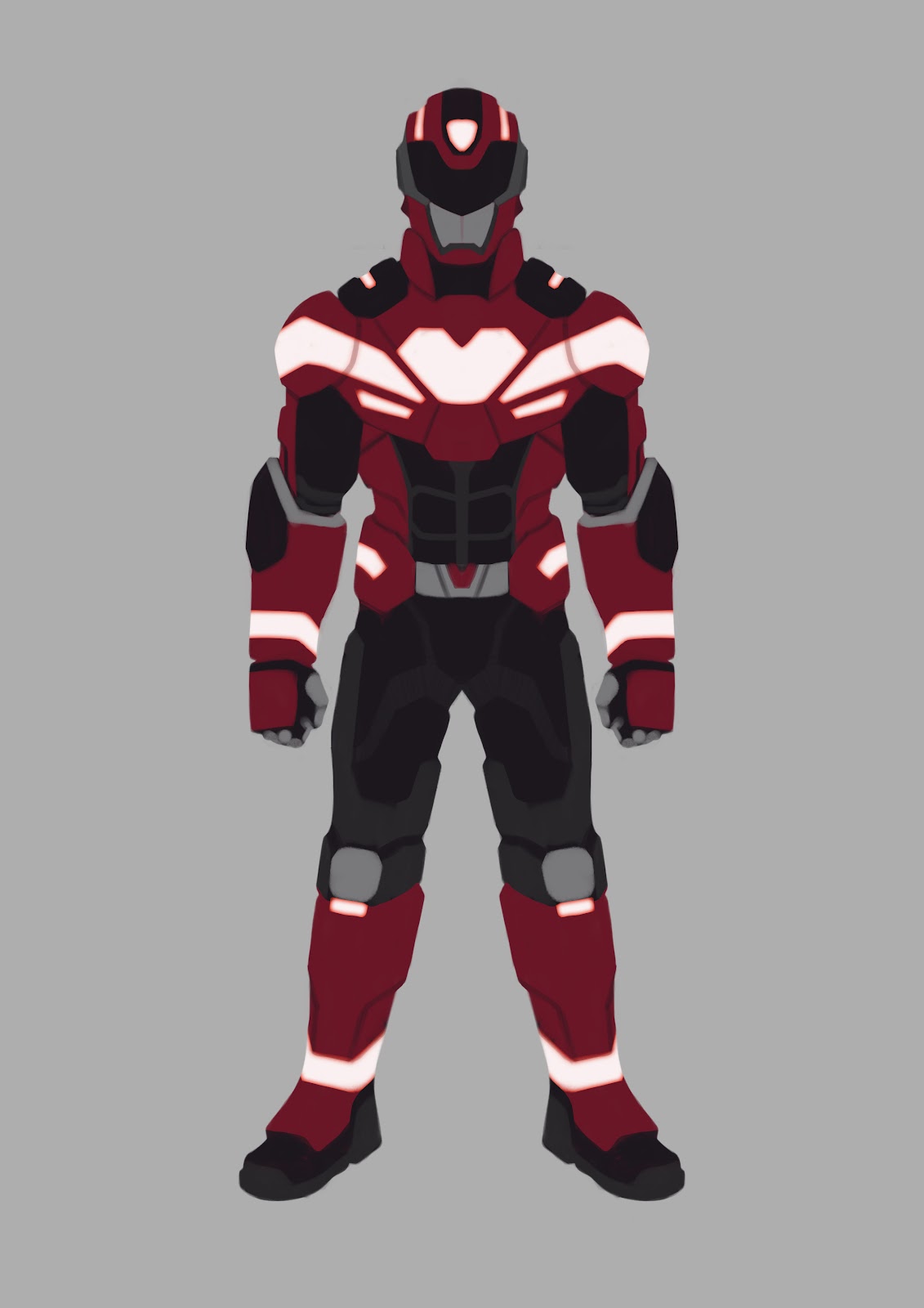
The Rider Suit

At this stage I have painted in my general lighting and the glossiness, specularity, and roughness of each material. I used the model me and my friend Chris made as base for the lighting and made some materials for the main areas to make sure I didn’t mess that up. Materials and how they interact with light still is something that’s fairly hard for me, hence I used a 3D model with different textures as reference.
After the paint, I put some different textures on the Rider Suit to enhance it, like textures from old WW2 tanks for the red paint to make it look it has some wear and tear, unique hexagonal patterns and kevlar for the under suit and more metallic bright metal for areas that need as less friction as possible.
What I tried to do is put more thought in just making an area such-and-such material by also thinking how to enhance it even further. The red painted metal for instance is also overlaid with lots of wear and tear, seeing the plain metal underneath paint, informing you, the viewer, it has seen lots of use. Making these look like claw marks for example adds the previous stated function of “fighting/defeating monsters” subtly into the mix a bit.
Stay tuned for the actual result in the final chapter where I recap everything I said in this tutorial! But first…
Assignment:
I want you to think on your own design, what materials make sense for what areas of the design and what extra materials and textures you can add in those areas. Is the character very clean? Are they very dirty? Is it a poor man that was once rich, so his fancy clothes are all tattered and dirty now?
I want you work on the materials used for your design and try and add that extra layer on top and make your character really feel alive
BONUS ROUND! EXTRA INFO FOR PHOTOBASHERS!
You probably have your materials already done thanks to your amount of photobashing, but once again this might be a pitfall. I want you to take a close look to all the textures you used in your design. Do they make sense? Do they synergize well with each other? Are there textures you want to keep, but the material doesn’t make sense?
Be very attentive to this and remove or paint over these areas to make them fit better into the design.