FEEL THE RHYTHM! READABILITY AND RHYTHM!
Readability is such a common word used by concept artist, but what does it mean exactly? Let us see!
readability
/riːdəˈbɪlɪti/
noun
noun: readability; plural noun: readabilities
the quality of being legible or decipherable.
"adding or removing space between lines can drastically improve readability"
That sums it up quite succinctly! Readability in design focuses purely making it easily decipherable for the viewer, but there are a ton of angles to reach a readable design. Readability is such a broad topic and covers a ton of the principles of design, most of which are taught as a beginner, so I won’t go into those in this tutorial.
However, I will talk briefly how readability is used effectively in character designs using my Rider Suit as example:
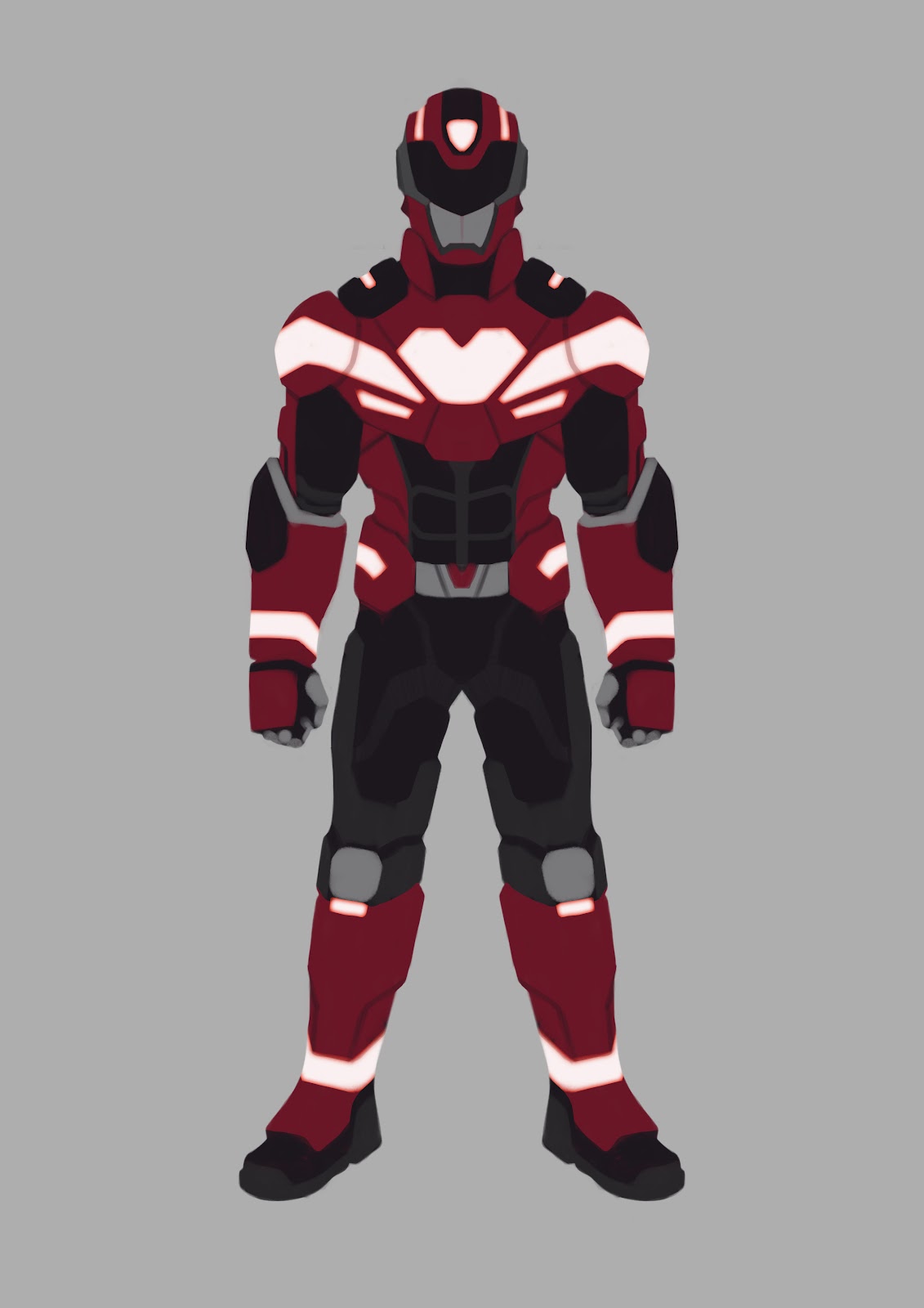
Question: At a first glance, what is most noticeable?
It’s the heart and the white lines, right? They are easily the brightest element in the design and attract attention with their contrast. Another reason you might not have noticed: The visor on the helmet and the shoulder straps point down upon the heart, making it so that they lead the viewer’s eyes.
What next? Probably one of the black areas interspersed between the red, so the helmet? Straps? The biceps or the abdomen even? That’s because the white area flares out. The design is made so that the viewer’s eyes mostly keep focused on the top half of the character. This is a prevalent technique used in many character designs in games, such as ‘League of Legends’ and ‘DOTA’, to name two that specifically call this out in their design philosophy.
It all has to do with rhythm.
Rhythm
Rhythm, in my personal view, is what makes a design truly readable. It gives your eyes a break from all the visual eye candy and gives them a well deserved rest.
Like I told above, most of the times the bottom portion of a character has less detail than the top half. Of Course, this can be flipped with the top having less visual information than the bottom, depending on where you want to place your emphasis, but it is far less common, since we as humans tend to look at the head/torso the most.
It does not have to specifically be a simple busy-calm rhythm. A rhythm is, as the name would imply, repeatable.
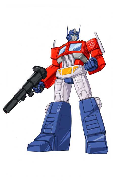
Let us take a look at our Optimus twins again:


Our 2018 Optimus is looking great. He has his rhythm pretty nicely down, while our slightly older 2007 Optimus is tripping all over his feet, why is that?
Simply put: Your eyes can’t rest. There’s no real “Calm” area. His legs look only slightly less busy, but only by the slightest margins.
Our 2018 Optimus might look similar to his cartoon counterpart, but his rhythm is solid. Calm, Busy, Calm, Busy. And even if he goes slightly busier again at the bottom of his legs, it is still less busy than the torso, which makes it quite elegant, design-wise.
Now a thorough look at my Rider Suit:

Seems quite readable, huh? There’s a definite rhythm in the suit, with the helmet being sliiiightly calmer than the chest before going to a dead calm again, only for it to become a bit busier again at the lower legs.
Assignment:
I want you to do these rhythm overlays on a character from any game or movie. Now that you also got your first wild designs ready from the previous chapter, do the blur pass I did back then to check if you still find him nice and readable. If you’re doubting or feel confident, do the rhythm overlay on your design too
The Rider Suit

At this point I adjusted my design (With help on the mechanical parts from fellow artist Chris Graf) and tried to add more of the points I described for myself, namely it being semi-grounded in reality and enhancing the user’s strength and speed. But now you think ‘But Stephan, you put in more details! Doesn’t this ruin the rhythm in your design?’. Let me show it again, now with color:

Looks a lot better, right? The extra details now also create an extra rhythm via color in the yellow areas:
Head height- no
Shoulder height - yes
Chest/Abdomen height- no
Hip height - yes
Upper leg height - no
Knee height - yes
Feet - no
So it is possible to create micro-rhythms within your main rhythms, but start big before you go small and check your design after doing such a change first before moving on.
BONUS ROUND! EXTRA INFO FOR PHOTOBASHERS!