BREAKDOWN! A SUCCINCT RECAP!
As this tutorial comes to a close, I want to take you along the small journey we took in this tutorial.
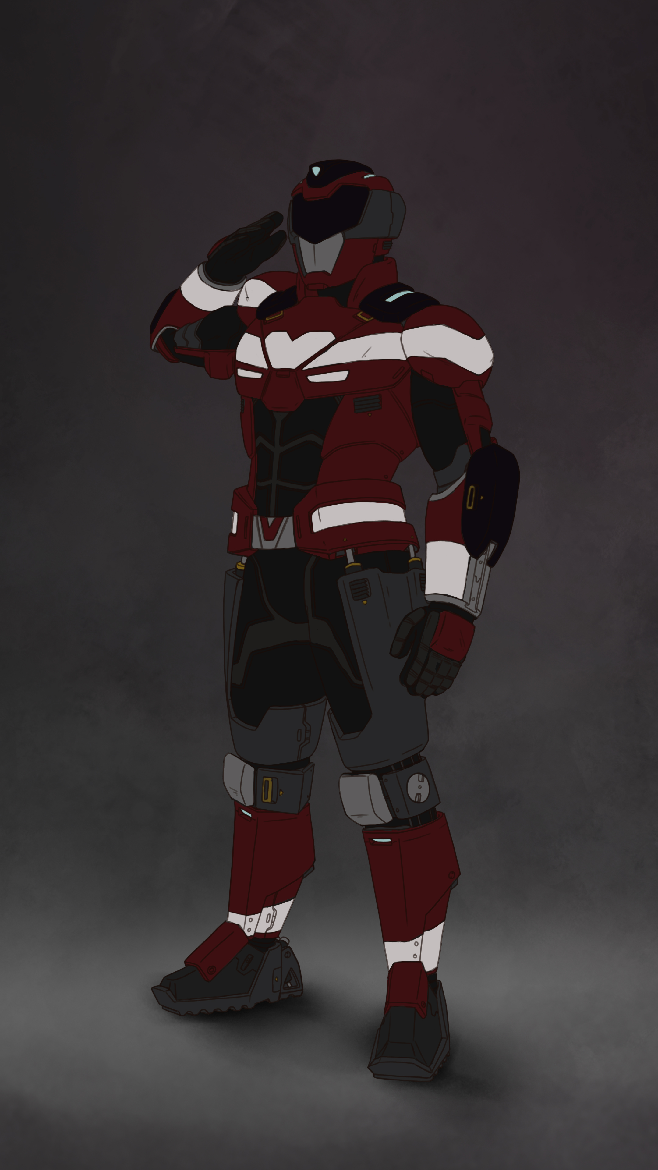
We started with exploring your basic design (idea). Think back again to the functions of it; What were those again? Which ones take priority over the others? Make those especially clear for yourself. I will do them again for my Rider Suit.

For the Rider Suit, the functions were the following:
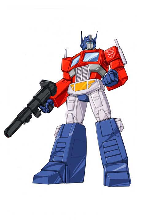
Inspired by Sentai/Power Ranger suits
The suit enhances the user’s strength and speed
Saving lives/doing rescue work is their primary function
Semi-grounded in reality
Defeating monsters is their secondary function
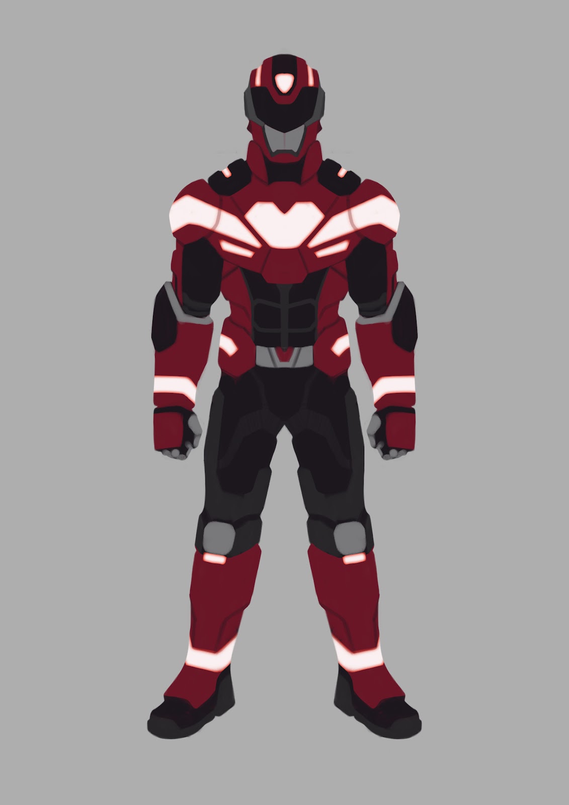
When looking at this design, points 1 and 4 come across, 2 and 3 a bit, and 5 not at all. I kept this in my mind as we moved on.
Because I already explored my character beforehand, I didn’t have to do this, but when looking back, I needed to have a lot more fun exploring this design. I was too caught up to make sure all functions were in it, I wasn’t making any real progress. For concept artist who need to make different iterations on the fly, you need to have a certain amount of speed, so don’t be too caught up by function for now and just have fun.
Now that you had your fun, let’s try and analyze your design. Is it readable? Do the blur technique first to see if it worked. If not, reign your design in a bit. This counts twice as much for you photobashers! Let’s see how my Rider Suit looks when doing that!
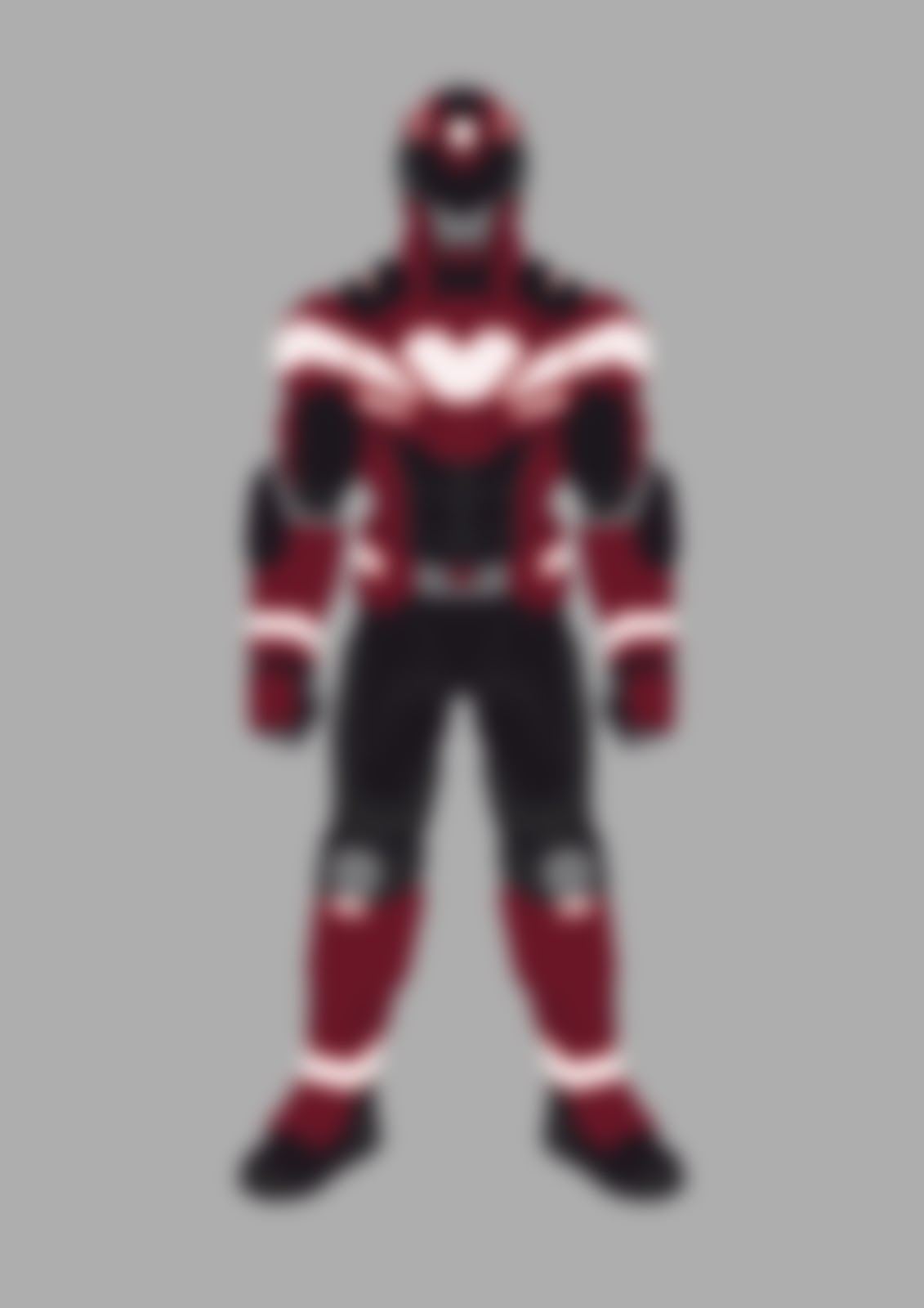
As you can see, he quite readable! Contrast, color and shape design are helping a lot here. They are there to guide the viewer’s eyes to wherever you want them to be, which is usually the top half of a character’s body.
If you are struggling with the readability of your design, let’s go check the rhythm.
Rhythm is very important to making the design readable. You want to give the viewers some places to rest their eyes a bit from all the brain-melting awesomeness that is your design, right? You don’t want them to explode from viewing all that awesomeness!
It starts with selecting your focus. Is it the top or bottom half of your character? And as the name already hints at, rhythms are repeatable.
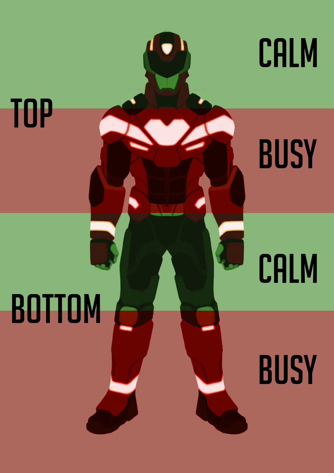
The top is the main focus here, but repeats the rhythm of calm-busy again. As long as you keep a close eye on your rhythm, you can expand your design with more detail with repercussions.
Everything can become a rhythm by using the basic design principles, such as color and contrast as it can even create micro-rhythms. Be wary though and always start big before going smaller.
Materials is where your design really starts to feel alive. Make sure the materials make sense and amplify the functions of your design.

When putting in the textures, again, make sure they enhance the function of that area of the design. This doesn’t mean you only have to put in one single material in that area. You can use multiple materials in the same colored area for more interesting details while keeping the readability the same.
If you have any functions you haven’t touched upon yet or want to push even more, you can always use the materials to amplify them.
Also, remember to think about layering more textures on top of the materials. Is the material clean, dirty, worn out or scratched up to name a few. Doing this will make your design feel more alive and amplify the functions even more.
The scratches that are now on the Rider Suit amplify its function of “fighting/defeating monsters”. While not a function, it shows that these suits are being used a lot in the world they are from. Doing these small details will make viewer curious to what world they from?
Keeping all of these lessons in mind it is time for all of us to finalize our designs. I hope you enjoyed this tutorial and learned a few things out of it! Thank you so much for reading this and I wish you good luck on your own art journey! Peace!

A big thanks to
Chris Graf
Constance Houang
Angel Roelofs