GRAB A MAP! EXAMINING YOUR DESIGN AND DECIDING YOUR APPROACH!
Alright, to start off… Have you’ve ever seen a game or a movie and saw a CG (Computer-Generated) character and were like ‘Eesh, what’s that ugly blob?!’? Well, then there’s a chance the character you saw wasn’t designed properly.
‘But Stephan, the character was based on a classic comic book character!’ You tell me. But what if I told you translating a graphically designed character to a full-fledged realistic character is a bit harder than just that?
A problem I think that has arisen in the last decade or two with the dawn of more proficient computers and software and an faster growing industry is that everything needs to be produced faster and faster and artists don’t have time to really think their designs through anymore.
Personally, I don’t believe that. Every design can be translated with the correct focus.
But first, a small notice:
In this tutorial I will show you how I designed my “Rider Suits” from my graduation project ‘Ouroboros’, the workflow which formed the basis for this tutorial. However, first, let us study some theory.
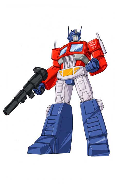
An example: Here you see Optimus Prime in his original animated series form. Pretty iconic, right?
Now let’s look at Optimus Prime from the first live-action ‘Transformers’ movie from 2007:

He looks… Okay? I mean, he looks pretty cool, but he feels off. Let me show you why:
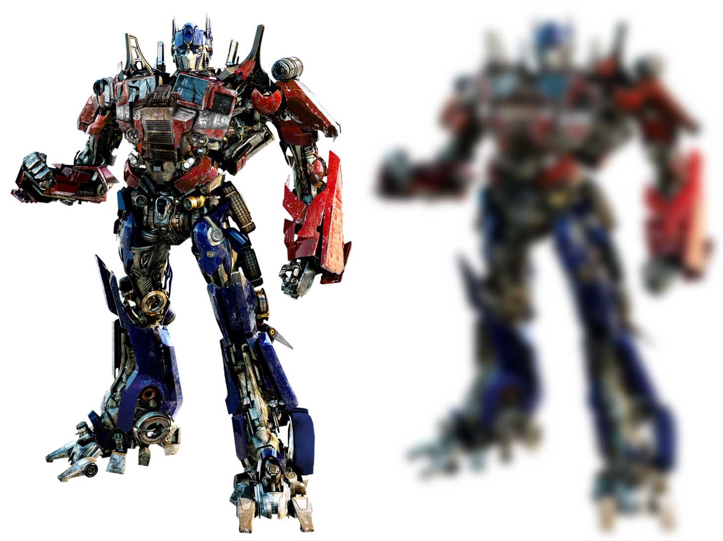
What happens when you squint your eyes is that he becomes a blob. You can see some minor colors, but overall you can’t really read his design anymore.
Now let’s take a look at 2018’s ‘Bumblebee’’s Optimus.
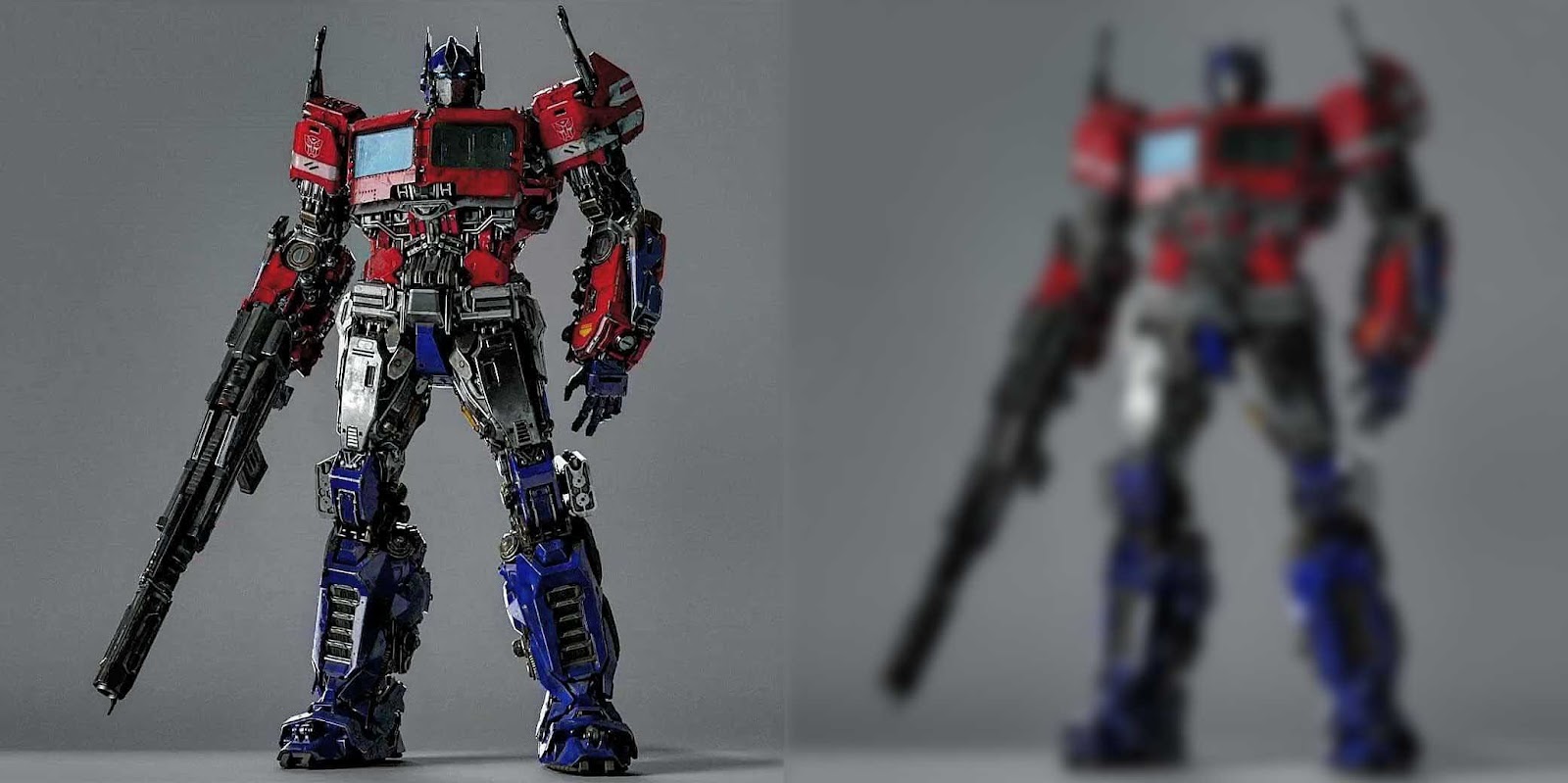
When you look at the blurred version he looks a lot better than the previous design in terms of readability. While this is way closer to the original cartoon version, it also advances the realism in the design by putting some mechanical elements in it, albeit sparingly around the center of the character.
QUESTION: I want you, as reader to take a good look at both designs. Write down at least 2 pros and 2 cons about both of the designs. An example:
Now try to make your own points (Either for Optimus here or another character from a movie or game). Each design always has pros and cons and it is up to you, the artist, to view them objectively and combine the best elements and mitigate the cons to the best of your abilities.
Function
That brings us to function. What is function exactly?
Function
/ˈfʌŋ(k)ʃ(ə)n/
noun
noun: function; plural noun: functions
an activity that is natural to or the purpose of a person or thing.
"bridges perform the function of providing access across water"
The function of a character should specifically communicate what purpose they serve.
In case of Optimus Prime, he’s a robotic alien disguised as a truck. While his cartoon design and his design in Bumblebee communicates he’s a robot that can disguise himself as a truck, it doesn’t communicate he is also alien to this world.
His 2007 design does communicate that he is alien in its shape language a bit better, but feels less like a transformed truck.
As many elements in a design should inform the viewer to the character’s/their suit’s function.
Another example:
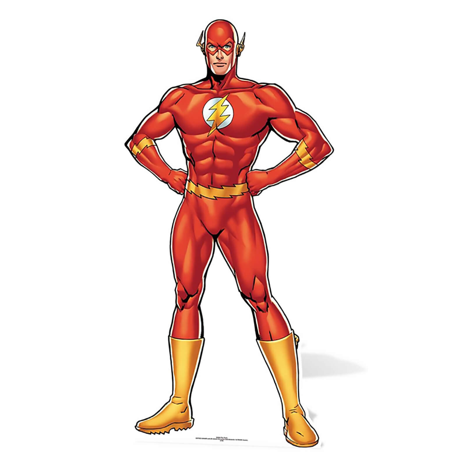
This is Barry Allen, ‘The Flash’. His moniker in DC Comics is “The Fastest Man Alive”, so let see how his suit has been translated in movies and tv series.

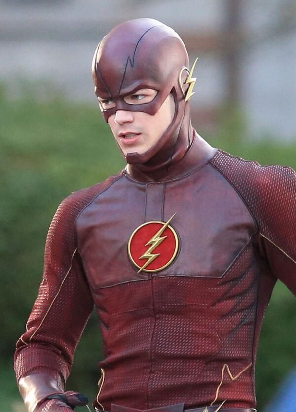
On the Left, The Flash in 2017’s Justice League. Right, The Flash in CW’s “The Flash”.
In both media they tell us, the audience, that the suits are made out of flame-retardant material to prevent it from burning up at high speeds. That’s the main function.
In Justice League’s case they tell us it’s material used on space shuttles to prevent it from burning up in the atmosphere, yet… It does not look like such. The wiring criss crossing over his body does not communicate anything as well and only makes the outfit less readable.
In CW’s version they tell us it’s an experimental firefighter suit. While sounding just as incredulous, it feels more plausible that it could be an experimental suit. We can see where the suit opens up, that the chest and head look more flexible than the arms and abdomen, parts that need a lot of range of motion.
Purely subjective, but in my opinion The Flash’s suit in Justice League fails to communicate what the CW suit does communicate on a far lower budget.
My own designs
Let us talk about my ‘Rider Suit’ design now.

Preliminary design for the ‘Rider suits’
Let us talk about what I wanted to communicate with this design first. It is:
Inspired by Sentai/Power Ranger suits
Semi-grounded in reality
The suit enhances the user’s strength and speed
Saving lives/doing rescue work is their primary function
Defeating monsters is their secondary function
Note: I incorporated most of what I want to accomplish with the design when doing this graphical version.
So, looking at this design, what do you, the audience, think I’ve already accomplished?
...Time’s up!
Looking at the design, I tried to do accomplish the following things:
It feels definitely inspired by Power Rangers/Sentai
The armor seems segmented and capable to exist in a semi-grounded world
The heart-shaped symbol on the chest and lines similar to what rescue workers have on the wrists and ankles imply they save lives/do rescue work
The pneumatic pumps on the back seemingly imply they are there to support the user’s back, but it is still very unclear
No reference to the suit being combat-ready, except for armor plating
ASSIGNMENT: How would you, the audience tackle this design? Draw a few sketches if you’d like! After that, I would like you to write down the core functions of your character/the suit they are wearing and… Go absolutely WILD with them! Have fun designing them! Keep the functions in mind, but go wild and only after the first few designs you start thinking about function.
BONUS ROUND! EXTRA INFO FOR PHOTOBASHERS!
In this tutorial I am going to do a minimum of photobashing, mainly using them to enhance the textures of the materials of my Rider Suit, because in my opinion that gives me the most control over the design possible.
You CAN photobash entirely over a rough sketch or just fully paint your design while following this tutorial. I will put in some minor notes, tips and tricks when fully photobashing your design instead of just doing some texture layovers.
