Posts

Posts uit juni, 2020 tonen

INTRODUCTIONS

Afbeelding
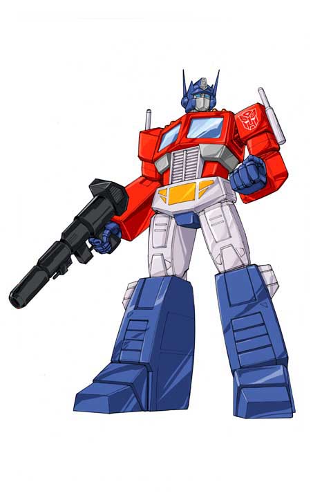
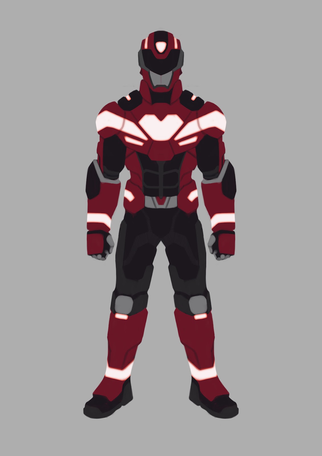
Hey there, friend-o! In this tutorial I’m going to explain to you how to go from graphically-designed characters (like those from your dad’s comic books!) and make them look like concept art from a big budget realistic game, like ‘Horizon: Zero Dawn’, ‘Death Stranding’ and ‘Gears of War’. I’m focusing specifically on making sure these designs have visual clarity and are clear in their function. I’m going to talk about how I tackle this process and give you different options depending on your style of producing art. These processes are intermediate in their complexity, but to master them can take quite some trial-and-error, though I will do my utmost best to make them easy to understand for all. This tutorial is primarily used to give you a good foundation to build off of. My examples will also be specifically geared towards the slightly more mechanical designs and armors as this gives you, dear reader, a better visual aid. INDEX This tutorial is structured in the following manner: C...

GRAB A MAP! EXAMINING YOUR DESIGN AND DECIDING YOUR APPROACH!

Afbeelding
Alright, to start off… Have you’ve ever seen a game or a movie and saw a CG (Computer-Generated) character and were like ‘Eesh, what’s that ugly blob?!’ ? Well, then there’s a chance the character you saw wasn’t designed properly.  ‘But Stephan, the character was based on a classic comic book character!’   You tell me. But what if I told you translating a graphically designed character to a full-fledged realistic character is a bit harder than just that? A problem I think that has arisen in the last decade or two with the dawn of more proficient computers and software and an faster growing industry is that everything needs to be produced faster and faster and artists don’t have time to really think their designs through anymore. Personally, I don’t believe that. Every design can be translated with the correct focus . But first, a small notice: In this tutorial I will show you how I designed my “Rider Suits” from my graduation project ‘ Ouroboros ’, the workflow which formed ...

FEEL THE RHYTHM! READABILITY AND RHYTHM!

Afbeelding
Readability is such a common word used by concept artist, but what does it mean exactly? Let us see! readability /riːdəˈbɪlɪti/ noun noun: readability ; plural noun: readabilities the quality of being legible or decipherable. "adding or removing space between lines can drastically improve readability" That sums it up quite succinctly! Readability in design focuses purely making it easily decipherable for the viewer, but there are a ton of angles to reach a readable design. Readability is such a broad topic and covers a ton of the principles of design, most of which are taught as a beginner, so I won’t go into those in this tutorial.  However , I will talk briefly how readability is used effectively in character designs using my Rider Suit as example: Question: At a first glance, what is most noticeable? It’s the heart and the white lines, right? They are easily the brightest element in the design and attract attention with their contrast . Another reason you might not hav...